
Why Dashboards Don't Fix Decision-Making
A dashboard is the easy part. The layer that turns a number into a decision is the part nobody is assigned to build, which is why it's usually missing.
Every few weeks, someone in leadership asks for a new dashboard.
I've run data teams where that request was most of the job. A VP wants deposits by country. The next week, the same thing by product. Then by cohort. Then with last quarter overlaid. Then "can we get this daily." The team ships all of it. Six months later there are forty dashboards, maybe three get opened, and the company still makes its real calls in a Slack thread, on instinct, at 11pm.
The reflex is to build more reporting. A cleaner dashboard, a faster one, one with better charts. Sometimes that helps. More often it just makes the confusion higher-resolution.
The dashboards were fine. The company had no way to turn them into decisions.
A dashboard is a surface, not a system#
A dashboard shows you numbers. A decision system is the structure that tells you what to do with them.
Daniel Schmidt at DoubleLoop put the failure well: "flat dashboards conflate leading and lagging indicators," and staring at the lagging ones is "like looking at the scoreboard when the game is already over." You see that revenue dropped. You can't see the input you could still move. So the meeting fills with people reading a scoreboard and adjourning a little glummer than they came in.
The structure a dashboard lacks is the set of questions it can't answer on its own:
- What decisions does leadership actually make on a regular cadence?
- Which metrics inform those decisions, and which are just interesting?
- Which numbers are leading, and which are lagging?
- Who owns each one, and what's the trusted definition?
- When one moves, what happens, and who moves?
Skip that, and people look, discuss, disagree, and move on. Nothing gets decided. Something gets viewed.
The layer everyone skips#
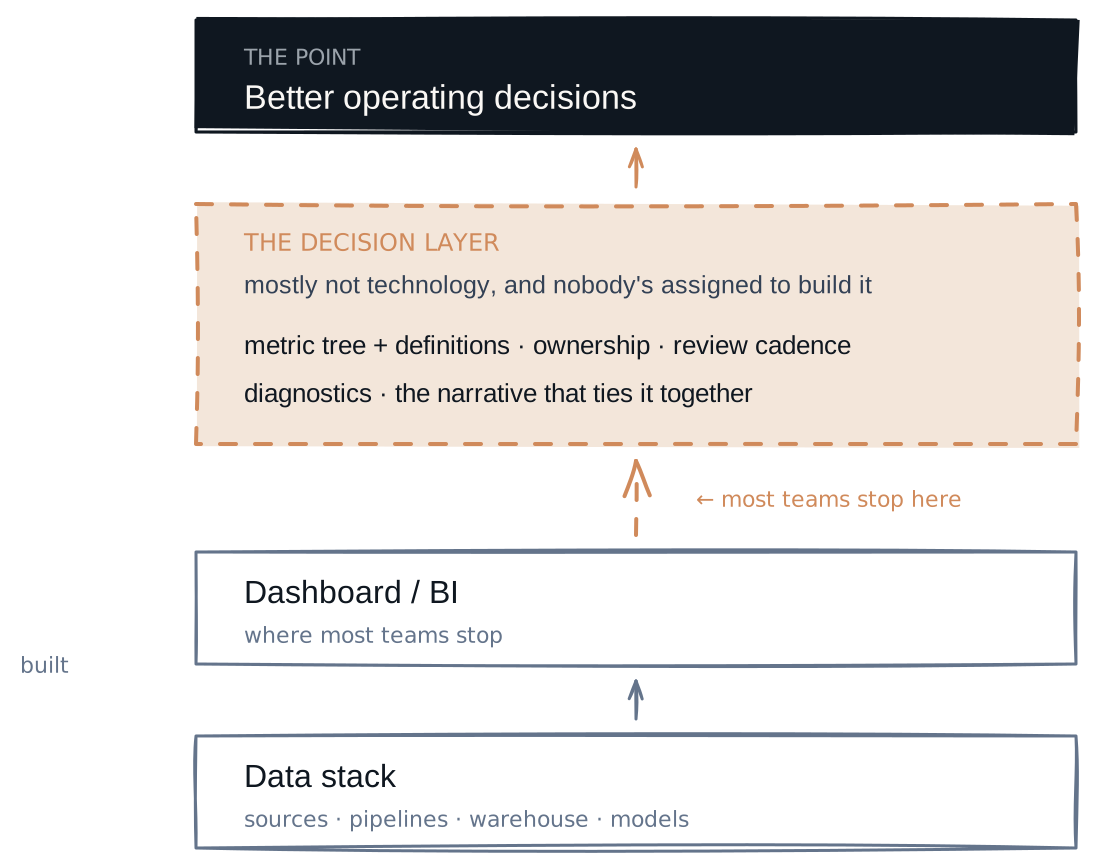
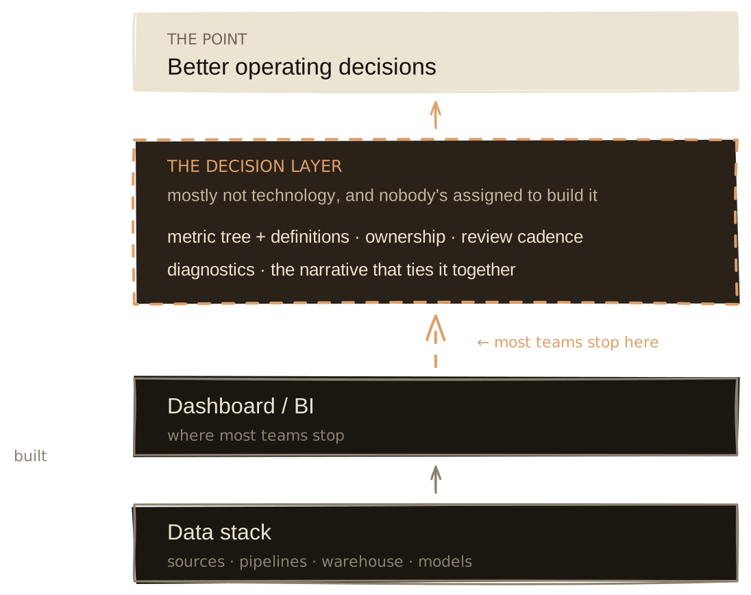
Most teams build the stack in the order you'd expect: sources, pipelines, warehouse, models, BI. Then they stop, because the dashboard is "done."
The layer that keeps getting skipped is the one carrying the weight. Call it the decision layer. It connects the numbers to action, and most of it isn't technology: metric trees and agreed definitions, an owner on every number, the review rituals that force a look, the diagnostics for when something moves, and the narrative that ties product, revenue, and risk into one story.
In my experience it's also the layer nobody is assigned to build. Engineering owns the pipelines. BI owns the charts. The decision layer sits in the gap between the chart and the choice, and gaps don't have owners.
Start from the decision, not the data#
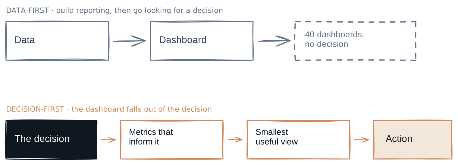
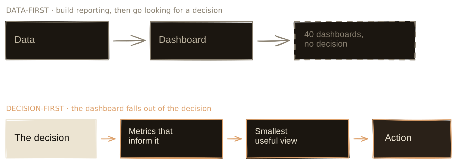
The inversion that fixes most of this is the first thing I do walking into a messy data function: don't ask what dashboard to build. Ask what decision you're trying to make better.
Cassie Kozyrkov, who built decision science at Google, calls the usual order backwards. Teams collect data, build a dashboard, then go looking for a decision to attach to it. The trap is that "once we've seen the answer, we're free to pick the most convenient question." Decision-first means naming the call, and what would change your mind, before you look at anything.
So before I touch a chart, I write down the five or so decisions leadership actually makes on a rhythm. Are we growing in the segment we want. Is retention healthy or quietly leaking. Where are we losing money. What do we fund next quarter. Each decision drags a short list of metrics behind it. That list is the dashboard. Everything else is a nice-to-have, and most of it never gets opened.
Why dashboards fall flat#
When a dashboard changes nothing, it's usually one of four reasons.
It's built around the data, not the decision. Most dashboards mirror the data model: users, transactions, orders, events, tickets. Leadership doesn't think in tables, they think in decisions. DoubleLoop's phrase for the gap is metrics "divorced from the actual work happening on the ground." A good view starts from the decision and works back to the handful of numbers that inform it.
It shows too much. More metrics don't buy more clarity, they buy more surface to argue over. Benn Stancil, who co-founded Mode, spent years watching self-serve BI fail and concluded those initiatives "solve the wrong problem": handing everyone more charts doesn't help when the hard part is knowing what to look for. His line stuck with me. "Opinionated simplicity is better than indifferent optionality." A leadership view is a designed instrument, not a catalogue of everything that moved.
It has no tree behind it. Revenue went up. Because activation improved, or conversion, or price, or mix, or one big customer, or a promo that won't repeat? Without a metric tree connecting the outcome to its drivers, every review is a guessing game. One caveat I've learned the hard way, and Paul Levchuk argues it well in "The Metric Tree Trap": the tree is a map, not an oracle. It can hide volatility and mix shifts, and a tidy parent-child correlation is often just arithmetic. Build the tree to structure the argument, not to end it.
Nobody's obligated to look. Even a good dashboard dies if no one has to read it on a rhythm. Amazon's fix is famous: no slide decks, "narratively structured six-page memos" read in silence at the top of the meeting, then a weekly business review that walks the numbers and argues only the exceptions. The mechanism does the work, not the chart. A number nobody is required to face changes nothing.
When a dashboard is actually enough#
The people selling you a "decision system" oversell it, so let me argue against my own thesis for a second.
Not every number needs a cathedral. If one team looks at one funnel every morning and acts on it, that already is a decision system. It has an owner, a definition, and a cadence. It's just small. Wrapping a metric tree and a review ritual around a number one person already acts on daily is its own kind of waste.
And Stancil, the same person who trashed self-serve BI, defends the dashboard elsewhere: "data and the dashboards that display it create a shared sense of reality." He's right. A good dashboard is where a team agrees on what's true, and that agreement is the floor everything else stands on.
So the real test isn't "dashboard or system." It's narrower: is anyone obligated to act on this, and do they know how? Answer yes and you already have a decision layer, however thin. Answer no, and a nicer chart just postpones the problem.
How to build the layer#
When I install this, I work backward from the decision, in roughly this order:
- Name the decision and who owns it.
- Draw the metric tree behind it.
- Agree the definitions. One number per metric.
- Build the smallest view that informs the decision.
- Put it on a review cadence.
- Add diagnostics for when a number moves.
- Improve it as the business learns.
The order is the whole point. The dashboard is step four of seven, not step one.
Step three is the one people underestimate. When Finance, Data Science, and Product each query slightly different tables, the CFO gets three numbers and trust quietly dies. Airbnb built an entire system, Minerva, because when the CEO asked something as simple as which city had the most bookings last week, "Data Science and Finance would sometimes provide diverging answers using slightly different tables, metric definitions, and business logic." If it bit Airbnb, it's biting you, you just haven't traced it yet.
And the diagnostics in step six earn their keep more than the dashboard does. The number everyone panics about is rarely the number that moved. A retention dip that looks like a product failure turns out to be one acquisition channel quietly sending worse users. You only catch that if the tree lets you walk from the outcome down to the driver. The value wasn't the chart. It was the model underneath that told you where to look.
The goal was never visibility#
Visibility is nice to have. What you're actually chasing is better operating decisions.
A company with this layer can answer, on any given Monday: what changed, why, does it matter, who owns the response, what do we do next, and how will we know if it worked. A company without it has forty dashboards and a Slack thread.
Dashboards aren't the work. The work is the layer around them, the definitions and ownership and context and cadence that turn a number into a decision. That's the spine a company leans on when it has to move fast and be right.
Sources & further reading
- Why Dashboards Fall Flat — Daniel Schmidt, DoubleLoop
- Data-Driven? Think again — Cassie Kozyrkov
- Why is self-serve still a problem? — Benn Stancil, Mode
- How Airbnb Achieved Metric Consistency at Scale — Robert Chang, Airbnb
- 2017 Letter to Shareholders — Jeff Bezos, Amazon
- The Amazon Weekly Business Review — Commoncog
- The Metric Tree Trap — Paul Levchuk
Read next
- Decision Systems9 min
Working Backwards From the Customer Outcome
Amazon's Working Backwards is really a direction of travel: start from the outcome you care about, and let the metric tree tell you what to build.
Read - Agentic Analytics20 min
What It Takes to Trust an AI Analyst
Lessons from six experiments on building reliable AI analytics: trusted data, governed definitions, a bounded verification harness, and evaluation that can see silent failure.
Read - Agentic Analytics10 min
How an AI Analyst Knows What It Can Answer
A closed-world ontology turns answerability from a model judgement into a system check: governed, computable but undefined, or unsupported by the warehouse.
Read
Want to see where your AI analytics can silently fail?
The AI Analytics Reliability Audit benchmarks your AI analyst against real business questions and leaves you with a prioritized repair plan.