
How to Build a Metric Tree Leadership Actually Uses
A metric tree is not a list of KPIs. It is a model of how your business creates outcomes, and a map for where to look when a number moves.
Most companies have plenty of metrics. What they lack is a way to see how those metrics relate.
Revenue is up. Is that acquisition, retention, pricing, or mix? Activation dropped (fewer new users reaching real value). Is that a product change, a cohort shift, or a tracking bug? Without structure, every one of these turns into a debate, and the debate is usually won by whoever is most senior rather than whoever is right.
A metric tree settles those debates by design. I've built them for fintechs and scaling teams, and the ones that stick look different from the tidy diagrams you see in blog posts. Here's how I actually build one.
What a metric tree actually is#
A metric tree is a model of how your business produces an outcome.
At the top sits a single outcome metric, often the North Star. Below it sit the drivers that mathematically or causally explain it. Below those sit their drivers, down to inputs a team can directly influence.
It isn't a dashboard. It isn't a list of KPIs. It's the logic that connects them. Done well, anyone can trace a top-level movement down to the input that caused it, and any team can see how their work rolls up to something the company actually cares about.
Draw it before the data exists#
The most common mistake is building the tree from whatever data you happen to have. I go the other way: I draw the tree first, on a whiteboard, before most of it is instrumented (wired up to actually measure anything).
That sounds backwards. It isn't. The tree is an alignment tool before it's a measurement tool. Sketching it forces the room to agree on what matters and what drives what, which is the hard part and has nothing to do with pipelines. The data comes after, aimed at the branches the tree says are worth measuring.
So start from the decisions leadership makes on a regular cadence:
- where to put the next dollar of acquisition spend;
- whether to prioritize activation or retention;
- which segment deserves more product attention;
- whether revenue quality is improving, or just revenue volume.
Each recurring decision implies an outcome metric and a small set of drivers. Those are the branches worth modeling. Everything else is noise you can leave out.
Decompose with real relationships#
Every level should answer one question: what would have to change for the level above it to move?
There are two honest ways to decompose.
Arithmetic. The parent is literally a function of its children. Revenue = customers × average revenue per customer. Signups = visitors × conversion rate. These are exact and reconcilable.
Causal. The parent is driven by, but not equal to, its children. Retention is driven by onboarding quality, time-to-value, and support experience. This is where judgment lives.
Label which is which. It changes how you read a movement, and it stops people from treating a soft correlation as a hard lever. The trap I see most often is decomposing into things that are merely related rather than driving. A metric tree is not a mind map.
Here's the same idea with numbers on it. Say we run a consumer habit app: people open it to log a daily habit, and the moment that actually delivers value is completing one. So the North Star is weekly value moments: the total number of habits completed across all users in a week. It sits right next to the user's real experience (a finished habit is the thing they came for), and it moves long before revenue does, which is exactly what you want a North Star to do.
That decomposes cleanly into three numbers you multiply: how many people showed up (active users), how often each came back (days per user), and how much they got done per visit (moments per day). Breadth × frequency × depth. Each term is a different team's job. Growth owns who shows up, Retention owns how often they return, and Product owns how much they do once they're inside. Under each sits the one lever that team can actually pull.
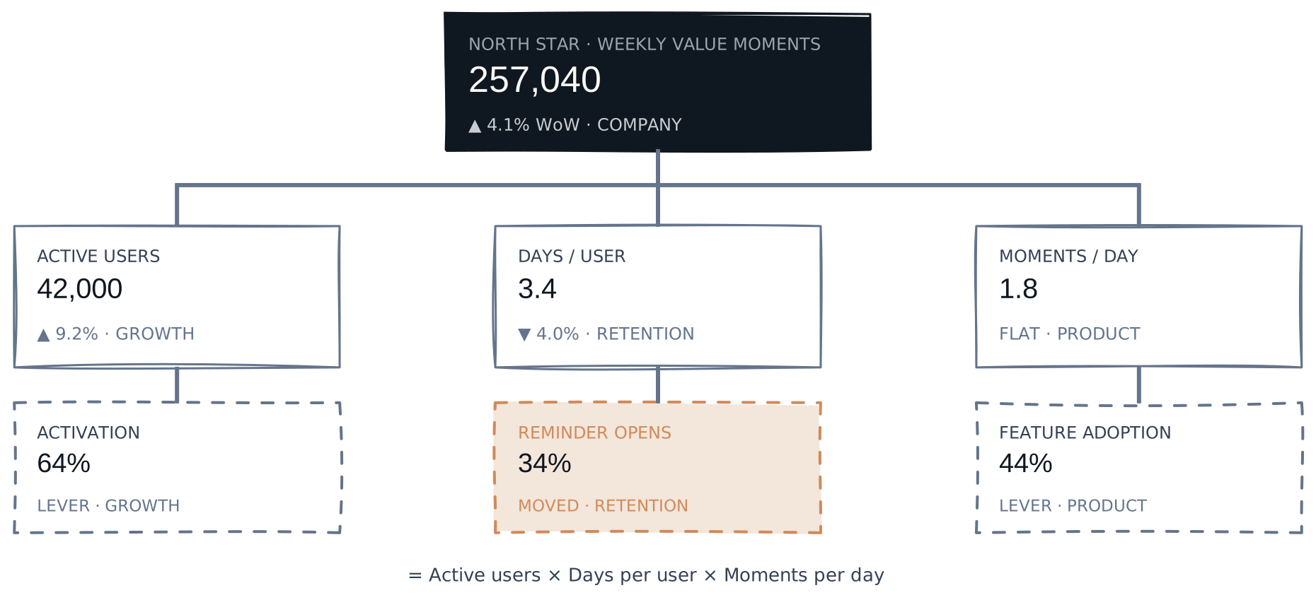
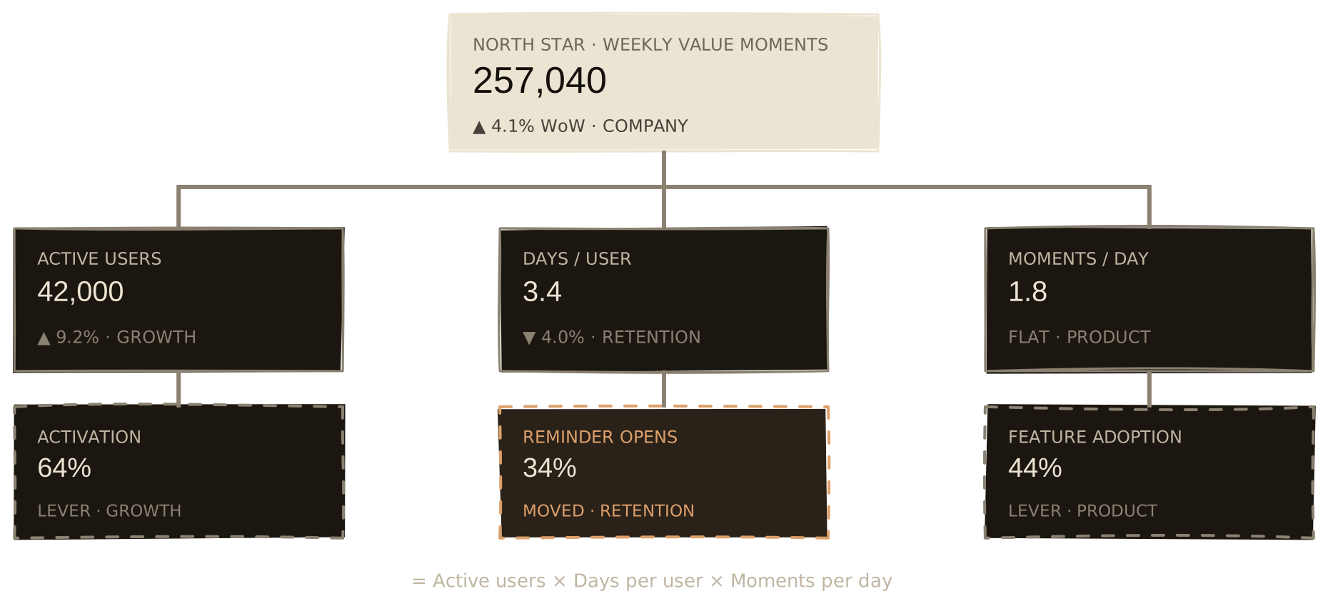
In practice, this catches problems a top-line number hides and hands each one to an owner. Weekly value moments are up 4%, so the dashboard looks green. Walk the tree anyway: active users (Growth) jumped 9%, moments per day (Product) are flat, but days per user (Retention) fell 4%. Growth is masking a frequency problem, and that branch belongs to Retention. Their lever, reminder opens, dropped from 41% to 34% after a notification change last sprint. The tree found the crack and named the team that owns it.
Instrument the inputs first#
Here's the sequencing that took me a while to learn. Once the tree is drawn, don't try to instrument all of it. Build the handful of input indicators at the top first: the ones closest to the customer and most within a team's control. They give the strongest early signal about the state of the business, and they're the metrics a team can actually move this quarter.
The supporting metrics that let you break a movement down further can come later, as the model earns its keep. Start wide and you get a hundred numbers nobody trusts. Start narrow and you get five nobody argues with.
Keep every node defined and owned#
A branch is only as trustworthy as its weakest definition. For each node, pin down:
- the exact definition, including the unit of analysis;
- what's included and excluded (test accounts, refunds, internal users);
- the owner accountable for the number;
- whether it's a leading or lagging indicator (does it move first, or only confirm the result after).
If two teams would compute a node differently, the tree quietly loses credibility, and once it does, people go back to their own spreadsheets. Definitions aren't bureaucracy. They're the thing that makes the number safe to act on.
Keep it small#
A metric tree is a tool for thinking, not a monument. If leadership can't hold the top two levels in their head, it's too wide. If a branch has never once explained a real movement, prune it.
The rule I use: one metric at the top, three to five drivers on the second level, and depth only where a team actually acts. Most healthy trees are surprisingly small, and the urge to keep adding branches is usually the data team's, not the business's.
Wire it into the cadence#
A metric tree that lives in a slide deck changes nothing. It earns its keep when it becomes the structure of your operating reviews:
- the weekly review walks the top of the tree and drills into whatever moved;
- anomalies get diagnosed by descending branches, not by guessing;
- experiments map to the node they're meant to move;
- new questions extend the tree instead of spawning another dashboard.
Over time the tree becomes shared language. People stop arguing about whose number is right and start arguing about which branch is telling the story, which is a far more useful argument to have. That shared language is what a decision culture actually runs on. And when you plan the next quarter, you work backwards down the same tree.
Operating the activation branch, day to day#
So let's follow one branch all the way into daily work. Earlier we walked the tree down from the top to find a crack in Retention; that was the tree diagnosing a drop after it happened. Operating a branch is the other direction: one team pushing a single number up, every day, before anything cracks.
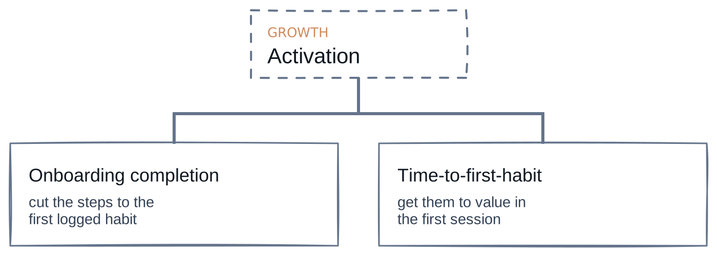
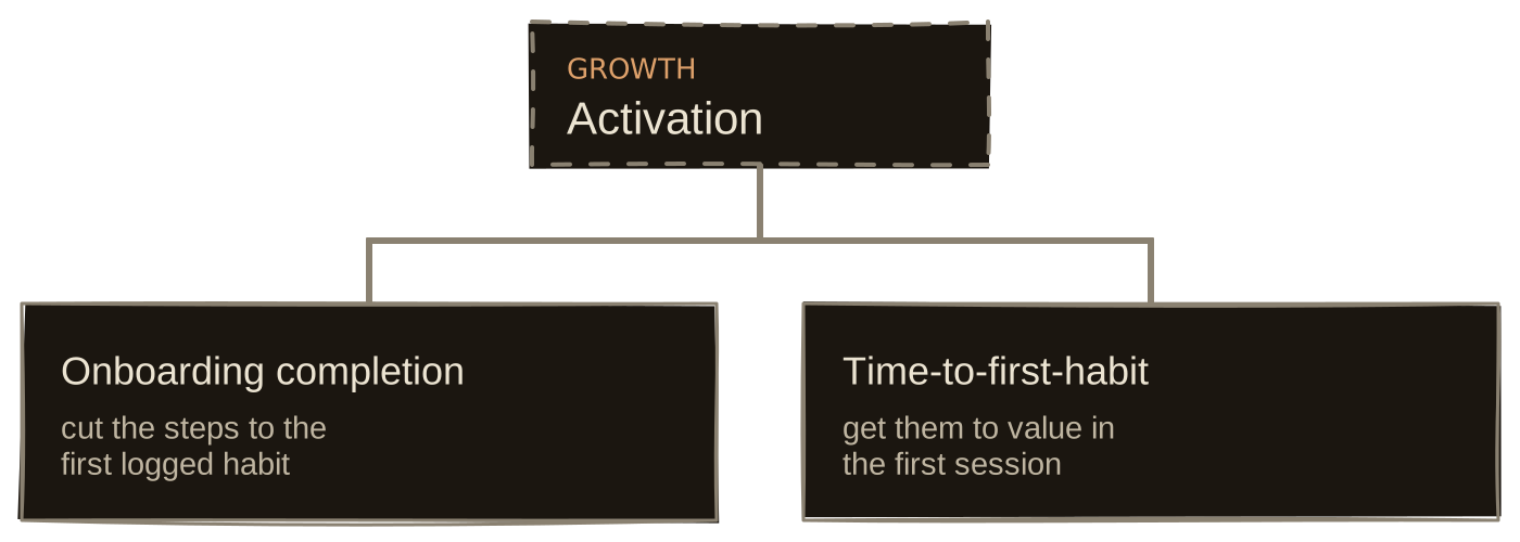
This gets into the weeds on purpose. If you run the company, that's the point: it's how you tell whether a team has a real decision system or just a dashboard. Take Growth, whose slice of the tree is active users. They can't move the North Star directly, and they don't own how often people return or how much they do inside. They own one question: how many people reach their first real value. That's activation, and the tree splits it into two things a team can actually change.
What they track#
The number Growth is judged on is activation rate, but they never touch it directly. They watch the two leading inputs that move first, onboarding completion and time-to-first-habit, plus one guardrail: the day-7 retention of activated users. The guardrail matters because activation is easy to fake by lowering the bar. Tie it to a real return, and "activated" keeps meaning something.
The dashboard, and how they read it#
The dashboard isn't a catalog of everything the app does. It's one screen: those four numbers, each against target, each with a status.
| Metric | Now | Target | Status |
|---|---|---|---|
| Activation rateoutcome | 64% | 70% | Watch |
| ↳ Onboarding completion | 74% | 80% | Watch |
| ↳ Time-to-first-habit | 4m 10s | under 3m | Off plan |
| Day-7 retention of activatedguardrail | 38% | 35%+ | On plan |
Green is on or ahead of plan, amber is slipping, red is off plan and needs a decision. This week activation is amber (below target but climbing), onboarding is amber, and time-to-first-habit is red. The red input is the assignment: that's where the next project goes. A board that's all green isn't a triumph; it usually means the targets were set too low. Amazon plans to hit about 75% of its goals for exactly that reason, and treats a red metric as information, not failure.
The daily rhythm, by channel and owner#
Nobody opens the North Star in the morning. They open this dashboard, and then they open their own channel, because activation doesn't happen in the aggregate. It happens channel by channel, and every channel has an owner who watches the same funnel end to end: budget in, then visitors, signups, and activations out. The last column, CAC, is budget divided by activations: what each new customer cost to acquire. It's a last-touch figure, so read each row as a rough split of where growth came from, not the final word. The branch review is really a stack of these.
| Channel | Owner | Budget | Visitors | Signups | Activations | CAC |
|---|---|---|---|---|---|---|
| Paid search | Dana | $12,000 | 18,400 | 2,100 | 1,180 | $10.17 |
| Referral | Priya | $2,000 | 6,900 | 1,650 | 1,140 | $1.75 |
| Content / SEO | Sam | $4,000 | 9,200 | 780 | 520 | $7.69 |
| Partnerships | Noah | $1,500 | 3,100 | 610 | 470 | $3.19 |
Each row is somebody's Monday. Dana sees a healthy top of funnel but soft activation, and knows her problem is onboarding, not traffic. Sam sees the opposite: plenty of visitors, thin signups. Priya's referred users cost a fraction of the rest ($1.75 against Dana's $10) and activate near the top. That's not just a cheap channel, it's a loop: activated users refer the next cohort, so money spent there compounds instead of just buying more visits. One caveat before you pour budget in: prove the loop is incremental. A friend's invite often lands on someone already halfway in the door, so hold a slice of referrals back and check they don't simply show up on their own. Pass that test and the $1.75 is real. Same tree, different branch of it, different move.
None of these numbers is an abstraction. Every cell is a list an owner can open, all the way down to a single user.
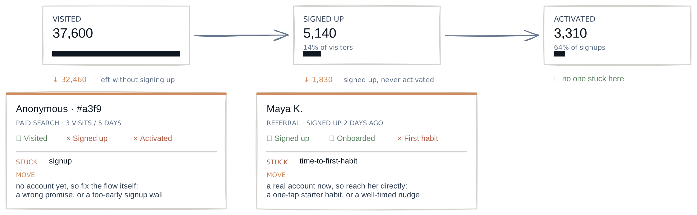
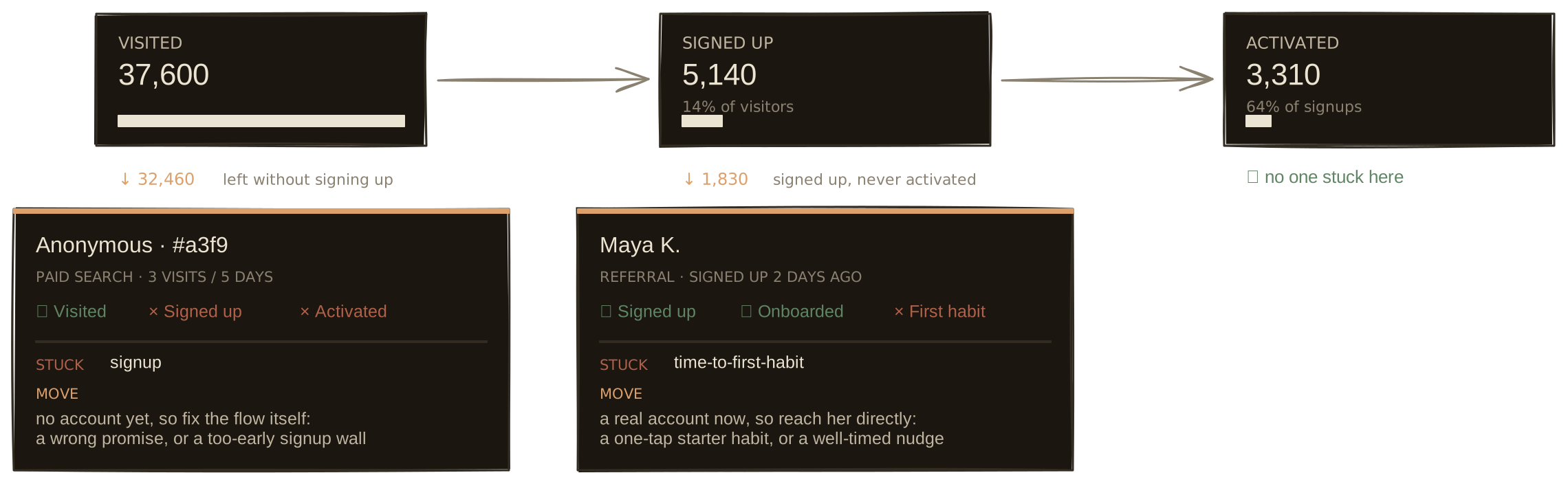
That's where the daily job bottoms out. The owner opens the stuck list, sees where each user stalled, and picks the move: fix the flow for the whole segment, or reach a single user directly. The outcome is a lagging scoreboard, the inputs are the steering wheel, and under the inputs are the users themselves.
The projects they run#
Every project names the sub-driver it's meant to move, and the red input gets first claim on the sprint. Time-to-first-habit is red, so this week's work sits under it:
- Pre-fill a starter habit so the first log is one tap instead of a setup form.
- Defer the notification-permission prompt until after the first completed habit, so onboarding doesn't stall on a system dialog.
- One-tap logging from the empty state, cutting the path to first value to a single action.
Onboarding completion is amber, so it gets a lighter touch: cut onboarding from six steps to three, moving account creation to after the first value.
These don't ship as fixes. They ship as bets. Each names the node it should move and by how much, then goes to half the new users while the other half sit in a holdout, so you can tell a real lift from a lucky week. Most won't clear the bar. A healthy team wins maybe one experiment in three and kills the rest fast, which is why nothing reaches the backlog without a node and a target: a bet that can't name the number it moves can't be settled once it ships.
So Monday doesn't open with new work. It opens with last week's results: which bets moved their node and which didn't, with a couple still too noisy to call. Winners fold into the target and raise it. Losers free the slot for whatever node is reddest now. That's the whole loop, and it's small: read the board, back the input furthest off plan, ship the change behind a holdout, watch it climb the tree or not, and go again. The North Star takes care of itself when the branch does.
What good looks like#
You know it's working when a top-level movement can be explained in one meeting instead of one week, teams can point to the node their work is meant to improve, new dashboard requests get rarer because the questions already have a home, and leadership trusts the numbers enough to decide without re-checking them.
That's the difference between measuring your business and understanding it.
Final thought#
A metric tree isn't about having more numbers. The point is the model: every metric with a place, a definition, an owner, and a line back to a decision.
That structure is the spine a company leans on when it needs to decide quickly and be right.
Sources & further reading
- Introducing Metric Trees — Levers Labs
- The North Star Playbook — Amplitude
Read next
- Decision Systems9 min
Why Dashboards Don't Fix Decision-Making
A dashboard is the easy part. The layer that turns a number into a decision is the part nobody is assigned to build, which is why it's usually missing.
Read - Agentic Analytics20 min
What It Takes to Trust an AI Analyst
Lessons from six experiments on building reliable AI analytics: trusted data, governed definitions, a bounded verification harness, and evaluation that can see silent failure.
Read - Agentic Analytics10 min
How an AI Analyst Knows What It Can Answer
A closed-world ontology turns answerability from a model judgement into a system check: governed, computable but undefined, or unsupported by the warehouse.
Read
Want to see where your AI analytics can silently fail?
The AI Analytics Reliability Audit benchmarks your AI analyst against real business questions and leaves you with a prioritized repair plan.